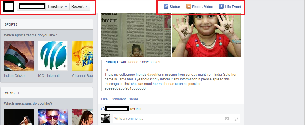
Facebook seems to introduce some changes in its interface today (well I noticed them today).
Check out the pictures below (changes marked in red):

I noticed:
- The sharing area has shrunk
- The “like”, “comment” and “share” buttons have changed
- There’s a wide gap between the trending section and chat section (couldn’t mention chat section due to privacy)

The other changes that I noticed were on my timeline, as I scroll down a menu bar sticks to the upper part of the page giving options “timeline”, “recent”, “status”, “photo/video” and “life event”.

Another change that I could notice was suggestions of new places, along with their ratings and reviews. Hmm, Facebook is utilizing my location.
Though these are some minor changes they are pretty good. Mark Zuckerberg is making sure that his users do not go through a “monotonous” experience with “Facebook”.
Hey Mark, when are you getting rid of the blue and white color scheme?
If you notice some other changes please mention them in the comments below.
